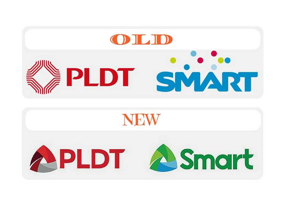
14 Jun What Can You Say About the New Logos of PLDT and SMART?
June 13, Monday, Philippine Long Distance Telephone Co. (PLDT) unveiled its new logo that reflects a fresh brand identity and presents the company’s dedication to serve customers way better than before. The PLDT’s changing of logo is along with its move to go beyond its traditional business and shift its focus to data-driven services.
Replacing the PLDT’s 33-year old logo, which can be described as repeated abstract figure of the telephone receiver, is the logo with a triangular shape which symbolizes for Delta or change with the three sides representing the company’s business pillars namely, exceptional people, meaningful innovations, and valuable customers.
As said by Manuel V. Pangilinan, PLDT and Smart chairman and chief executive officer, “Taken together, these three pillars create tremendous energy that will enable our customers to achieve their limitless potential. The triangle’s three sides support each other. Thus, an inherent strength flows harmoniously among the sides to sustain the structure.”
PLDT is also looking forward to changing its name from “Philippine Long Distance Telephone Company” to “PLDT Inc.”, which is for them, to better represent the new path they are taking.
Smart also changed its logo.
“Rather than allow ourselves to be disrupted by new technologies, we are disrupting ourselves. We have embarked on a digital pivot to enable us to serve the increasing needs of our people’s digital lifestyle and the country’s growing digital economy,” Pangilinan added.


No Comments